


Fertige Reports
Vorgefertigte Reports. Unendlich anpassbar.
byrdAI bringt fertige Reports und Dashboards mit, Du fragst einfach nach ihnen. Und jeder davon ist nur der Startpunkt: Ändere Zeiträume, kombiniere Datenquellen, lass Dir Charts bauen oder plane Reports als wiederkehrendes Briefing.
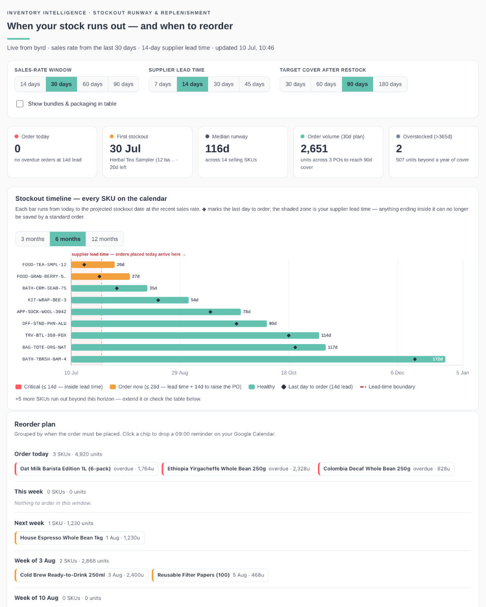
Wann jeder SKU bei aktueller Verkaufsgeschwindigkeit ausverkauft ist und bis wann Du spätestens nachbestellen musst.
Build a live, persisted HTML dashboard artifact that shows when each of my products runs out of stock and when I have to reorder, pulling fresh data from byrd every time it opens. Single self-contained HTML file, light mode only.

## Data source
- Tool: report_days_of_cover (byrd MCP), called with { lookback_days: <14 | 30 | 60 | 90, default 30> }; cache per lookback. Single tool call per window.
- Row fields: product_name, sku, product_type, current_stock, units_sold, avg_daily_velocity, days_of_cover (nullable), projected_stockout_date, reorder_point.
- Sellable = product_type "product" or "prepacked_product". Bundles/packaging read as 0 on-hand (assembled on demand) - exclude from analytics, show in the table only behind a toggle.

## Key formulas
- Order-by day = days_of_cover - supplier lead time (negative = overdue).
- Suggested order qty = ceil(velocity x (lead time + target cover) - current_stock); 0 for SKUs with > 365d cover.
- Risk bands relative to lead time: Critical <= lead (red #FD5C63 - inside lead time, a standard order can no longer save it), Order now <= lead + 14d planning buffer (amber #F2A03D), Healthy <= 365d (turquoise #62C2AF), Overstock > 365d (grey #7C8698).

## Tech & style
- Chart.js v4 and Grid.js v5 from the allowed CDN, no other libraries, system font stack.
- Accent turquoise #62C2AF (#2F7A68 for links), text #293141, secondary #4E5664, borders #E5EAEE, page #FAFAFA, cards #fff.

## Layout (top to bottom)
1. Header: eyebrow "Inventory intelligence - stockout runway & replenishment", H1 "When your stock runs out - and when to reorder", turquoise accent rule, subtitle with sales-rate window, lead time and last-updated time. No logo.
2. Controls card: sales-rate window buttons 14 / 30 / 60 / 90 days (re-fetches); supplier lead time buttons 7 / 14 / 30 / 45 days; target cover after restock buttons 30 / 60 / 90 / 180 days (lead + target re-render client-side); "Show bundles & packaging in table" checkbox.
3. Five KPI cards: Order today (overdue count at the chosen lead), First stockout (product + days left), Median runway, Order volume (units across POs in the next 30 days to reach target cover), Overstocked > 365d.
4. Hero panel "Stockout timeline - every SKU on the calendar": Chart.js floating horizontal bars from 0 to days_of_cover on a days-from-today linear x-axis with date-formatted ticks and a 3 / 6 / 12-month horizon selector. Custom plugin draws: a shaded lead-time zone from today with the caption "supplier lead time - orders placed today arrive here" in a reserved strip ABOVE the plot area (never over a bar), a today line, black diamond markers at each bar's order-by day (skip the diamond when it would collide with the bar end), and day labels at the end of each bar (drawn in white inside the bar when it reaches the right edge, with an overflow marker). Bars coloured by risk band; note below for SKUs beyond the horizon.
5. Two panels side by side: a velocity-vs-runway bubble risk matrix (x = days of cover capped at 365, y = units/day, bubble radius = sqrt of stock, shaded red "act now" zone left of the lead time) and a coverage distribution bar (<=30 / 31-60 / 61-90 / 91-180 / 181-365 / 365+ days).
6. "Reorder plan" panel: bucketed rows - "Order today" (overdue), This week, Next week, the following two ISO calendar weeks (always shown, even when empty), then non-empty month rows up to a year out. Each row shows SKU count + total suggested units and risk-coloured chips per SKU (name, order-by date, qty). Optional: clicking a chip creates a 09:00-09:30 Google Calendar event on the order-by date via the Google Calendar connector (create_event), with stock/velocity/qty and a byrd link in the description; remember created events in localStorage so chips show a checkmark linking to the event instead of creating duplicates.
7. Recommended actions: expedite SKUs inside the lead time, overdue POs, the 30-day PO plan, SKUs with thin absolute stock, taper reordering on overstock. Data-driven with impact numbers.
8. Grid.js table (sortable, searchable, 12 rows/page) sorted by soonest stockout: SKU (hover copy button + open-in-byrd link to https://app.getbyrd.com/inventory/products/all?q=<sku>&fields=sku), Product, Stock, Sells/day, Days of cover as an inline mini-bar + number, Order by (badge: "overdue" or date), Suggested qty. Above: "Showing N products" + a "Copy order plan" button that copies SKU<TAB>qty lines for every SKU with a suggested qty.
9. Footer explaining: runway = available stock at the recent sales rate; order-by = runway minus lead time; suggested qty covers lead time + target cover; bundles excluded.

## Details
- Thousands separators; dates as e.g. "30 Jul". Escape all dynamic HTML.
- Custom positioned tooltip div driven by data-tip attributes (native tooltips don't work in the sandbox).
- Handle a missing connector gracefully; show loading and error states.

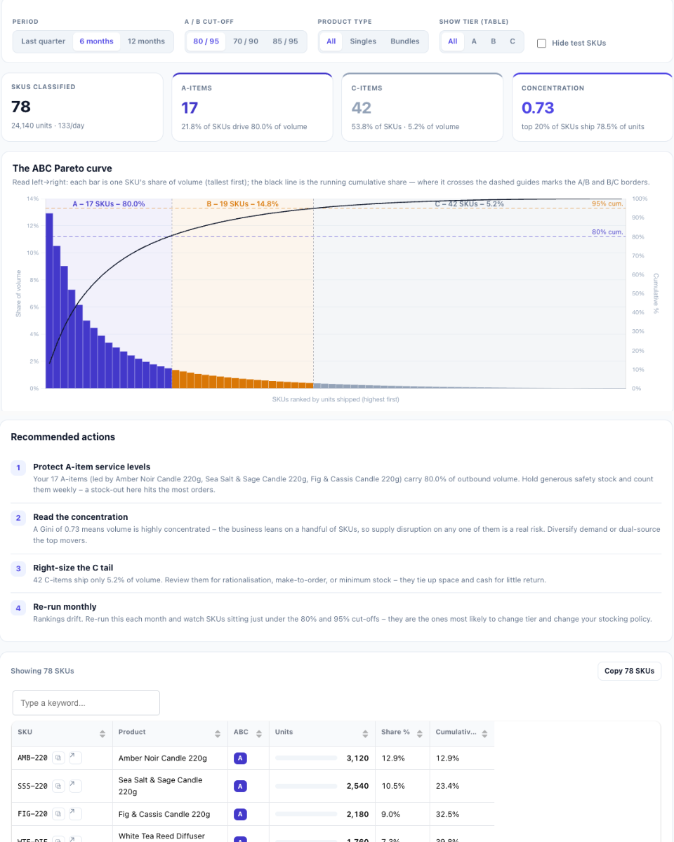
Finish by verifying the rows load, the Gantt renders with correct lead-time shading and markers, and there are no console errors.Welche SKUs Dein Volumen tragen und welche Lager- und Bestellpolitik jede Klasse verdient.
Build a live, persisted HTML dashboard artifact that runs an ABC analysis of my products, pulling fresh data from byrd every time it opens. Single self-contained HTML file, light mode only.

## Data source
- Tool: report_abc_analysis (byrd MCP), called with { date_from, date_to } for a rolling window: Last quarter / 6 months (default) / 12 months. Cache per window.
- Row fields: product_name, sku, product_type, units_shipped, cumulative_pct, abc_class. One row per shipped SKU (no zero-movers); classification is by units, not revenue.
- Recompute the A/B/C tiers client-side from cumulative share of units so thresholds and filters stay live: default A = top SKUs up to 80% cumulative volume, B = to 95%; offer alternative cut-offs 70/90 and 85/95.
- Merchandise only: singles = product/prepacked_product, bundles = bundle; exclude packaging/branding/alias types.
- The show-tier control is a table-only drill; KPIs and charts stay at universe level (period + product-type + hide-test applied).

## Tech & style
- Chart.js v4 and Grid.js v5 from the allowed CDN, no other libraries, neutral system font stack.
- Generic light palette, indigo accent #4F46E5. Tier colours: A indigo #4338CA, B amber #D97706, C slate #94A3B8.

## Layout (top to bottom)
1. Header: eyebrow "Inventory prioritisation - ABC classification", H1 "ABC analysis - where your outbound volume concentrates", indigo accent rule, subtitle with the window's date range + "classified by units shipped" + last-updated time. No logo.
2. Controls card: period buttons Last quarter / 6 months / 12 months (re-fetches); threshold buttons 80/95 / 70/90 / 85/95 (A/B cut-off); product-type buttons All / Singles / Bundles; show-tier buttons All / A / B / C (table drill); "Hide test SKUs" checkbox.
3. Four KPI cards: SKUs classified (+ total units + per day), A-items (count, "x% of SKUs drive y% of volume"), C-items (count + tiny volume share), Concentration (Gini index + "top 20% of SKUs ship x% of units").
4. Hero panel "The ABC Pareto curve": every shipped SKU as a share-of-volume bar coloured by tier + a cumulative line on a right 0-100% axis. Custom plugin work: shade the A/B/C x-zones with tier tints, draw dashed horizontal guides at the two cumulative cut-offs, vertical dividers at the tier borders, and a zone label per tier ("A - n SKUs - x%"). One-line reading guide above.
5. Three tier policy cards (A/B/C): recommended service level (98-99% / 95% / 90%), cycle-count cadence (weekly / monthly / quarterly), and safety-stock stance per tier, each with the tier's SKU count and volume share.
6. Two panels side by side: "Vital few vs. trivial many" (two 100%-stacked horizontal bars - share of SKUs vs. share of volume, split A/B/C, with percentage labels drawn inside the segments) and a Lorenz concentration curve (cumulative % of SKUs vs. cumulative % of volume, ascending, filled, against the equality diagonal, with the Gini value annotated).
7. Recommended actions: protect A-item service levels (name the top SKUs), interpret the concentration (high Gini = fragile dependence vs. balanced), right-size the C tail (count + suggestions), re-run monthly and watch SKUs near tier borders.
8. Grid.js table (sortable, searchable, 12 rows/page) sorted by units desc: SKU (hover copy button + open-in-byrd link to https://app.getbyrd.com/inventory/products/all?q=<sku>&fields=sku), Product, ABC badge, Units as a tier-coloured mini-bar + number, Share %, Cumulative %. Above: "Showing N SKUs" + "Copy N SKUs" button.
9. Footer explaining: tiers are by units shipped (not revenue) over the selected window; the tool's own abc_class uses 80/95 and the dashboard reproduces it as the default; only SKUs that shipped appear; note the possible ABC x XYZ extension with a demand-variability view.

## Details
- Thousands separators; shares with 1 decimal. Escape all dynamic HTML.
- Custom positioned tooltip div driven by data-tip attributes (native tooltips don't work in the sandbox).
- Handle a missing connector gracefully; show loading and error states.

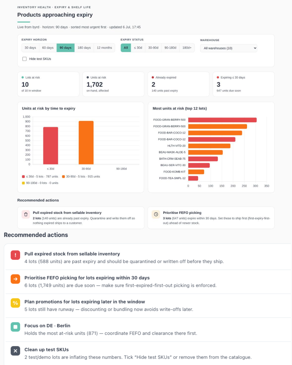
Finish by verifying the rows load, the Pareto / stacked bar / Lorenz charts render, and there are no console errors.Welche MHD-Artikel bald ablaufen, wo sie liegen und was Du zuerst abverkaufen solltest (FEFO).
Build a live, persisted HTML report artifact that shows my lot-tracked products approaching or past expiry, pulling fresh data from byrd every time it opens. Single self-contained HTML file, light mode only.

## Data source
- Main tool: report_expiring_lots (byrd MCP), called with { within_days: <30 | 60 | 90 | 180 | 365, default 90> }. Cache per horizon.
- Row fields: product_name, sku, lot_number, warehouse_id, expiry_date, days_to_expiry (negative = already expired), stock_in_lot.
- Also call get_merchant_info once and use its warehouses list (id, code, name/display_name, country_code) to translate warehouse_id into a readable name shown as a small country-code chip + label. If an id can't be resolved, label it "Warehouse A/B/..." instead of showing a raw UUID.

## Tech & style
- Chart.js v4 and Grid.js v5 from the allowed CDN, no other libraries, system font stack.
- Accent turquoise #62C2AF (#2F7A68 for links), text #293141, secondary #4E5664, borders #E5EAEE, page #FAFAFA, cards #fff.
- Time-to-expiry tiers: <=30d (incl. expired) red #E5484D, 30-90d orange #F97316, 90-180d yellow #F5C518, 180d+ green #22A06B.

## Layout (top to bottom)
1. Header: eyebrow "Inventory health - expiry & shelf life", H1 "Products approaching expiry", turquoise accent rule, subtitle with horizon + "sorted most urgent first" + last-updated time. No logo.
2. Controls card: horizon buttons 30 / 60 / 90 / 180 days / 12 months (re-fetches); status filter All / <=30d / 30-90d / 90-180d / 180d+; warehouse dropdown (populated from the data, with lot counts); "Hide test SKUs" checkbox.
3. Four KPI cards: Lots at risk (of N), Units at risk, Already expired (with units past expiry), Expiring <= 30 days (with units due soon).
4. Two charts side by side: "Units at risk by time to expiry" (bars per time bucket with legend showing lots + units) and "Most units at risk (top 12 lots)" (horizontal bars coloured by tier; tooltip with lot number, units, expiry date and warehouse).
5. Recommended actions (FEFO-driven): pull expired stock from sellable inventory, prioritise FEFO picking for lots expiring within 30 days, plan promotions for lots expiring later in the window, focus on the warehouse holding the most at-risk units, clean up test SKUs. Friendly empty state if nothing is at risk.
6. Grid.js table (sortable, searchable, 12 rows/page) sorted most urgent first: SKU (hover copy button + open-in-byrd link to https://app.getbyrd.com/inventory/products/all?q=<sku>), Product, Lot, Warehouse (chip + name), Expiry date, Time to expiry ("in 9d" / "12d ago", tier-coloured), Units. Above it: "Showing N lots" + "Copy N SKUs" button (de-duplicated).
7. Footer explaining: shows lots expiring on or before today + horizon; expired lots always appear with negative day counts; units are on-hand stock per lot per warehouse.

## Details
- Thousands separators; dates as YYYY-MM-DD. Escape all dynamic HTML.
- Custom positioned tooltip div driven by data-tip attributes (native tooltips don't work in the sandbox).
- Handle a missing connector gracefully; show loading and error states.

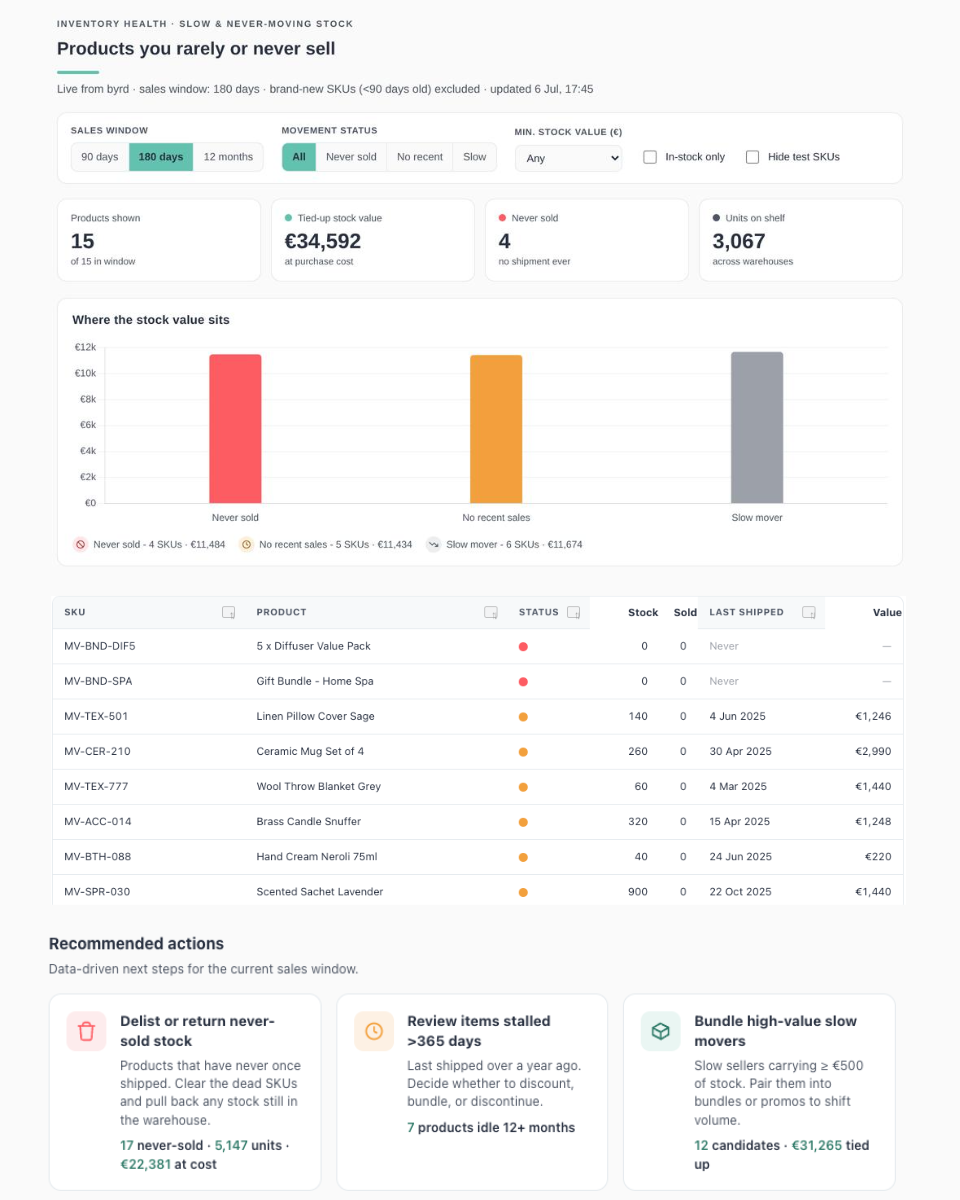
Finish by verifying the rows load and charts render without console errors.Welche Produkte kaum oder nie verkaufen, wie viel Kapital sie binden und was Du damit tun kannst.
Build a live, persisted HTML dashboard artifact that shows the products I rarely or never sell, pulling fresh data from byrd every time it opens. Single self-contained HTML file, light mode only.

## Data source
- Tool: report_slow_movers (byrd MCP).
- On first load and whenever the sales window changes, call it with { days: <90 | 180 | 365, default 180>, max_units_sold: 5, min_stock: 0, created_before: <today minus 90 days as YYYY-MM-DD> }.
- Row fields: product_name, sku, movement_status ("never_sold" | "no_recent_sales" | "slow"), current_stock, units_sold, last_outbound_date, days_since_last_outbound, created_date, stock_value (nullable, EUR at purchase cost). Cache per window so switching back is instant.

## Tech & style
- Chart.js v4 and Grid.js v5 from the allowed CDN, no other libraries, system font stack.
- Accent turquoise #62C2AF (#2F7A68 for links), text #293141, secondary #4E5664, borders #E5EAEE, page #FAFAFA, cards #fff.
- Status colours: never sold = red #FD5C63, no recent sales = amber #F2A03D, slow = grey #9CA0A8.

## Layout (top to bottom)
1. Header: uppercase eyebrow "Inventory health - slow & never-moving stock", H1 "Products you rarely or never sell", short turquoise accent rule, subtitle with active window + last-updated time. No logo.
2. Controls card: sales-window buttons 90 days / 180 days / 12 months (re-fetches); status filter All / Never sold / No recent / Slow; min-stock-value select (Any / EUR 100+ / 500+ / 1,000+); "In-stock only" and "Hide test SKUs" checkboxes.
3. Four KPI cards reflecting the filters: Products shown (of N), Tied-up stock value, Never sold count, Units on shelf.
4. Two charts stacked vertically: "Where the stock value sits" (bar of value per status, custom legend with counts) and "Biggest tied-up capital (top 12)" (horizontal bars coloured by status, SKU on axis, product details in tooltip).
5. Recommended actions: data-driven cards - delist/return never-sold stock, review items stalled >365 days, bundle high-value slow movers (value >= 500), clean up test SKUs, add missing cost prices. Each with icon, headline and impact numbers.
6. Grid.js table (sortable, searchable, 12 rows/page) sorted by stock value desc: SKU (with hover copy-SKU button and open-in-byrd link to https://app.getbyrd.com/inventory/products/all?q=<sku>&fields=sku), Product, Status icon with tooltip, Stock, Sold, Last shipped ("Never" if never), Value. Above it: "Showing N products" plus a "Copy N SKUs" button (newline-separated).
7. Footer explaining the definition (shipped <= 5 units in the window) and that stock value is a floor when cost prices are missing.

## Details
- EUR whole numbers, thousands separators. Escape all dynamic HTML.
- Use a custom positioned tooltip div driven by data-tip attributes (native title tooltips don't work in the sandbox).
- Handle a missing connector gracefully; show loading and error states.

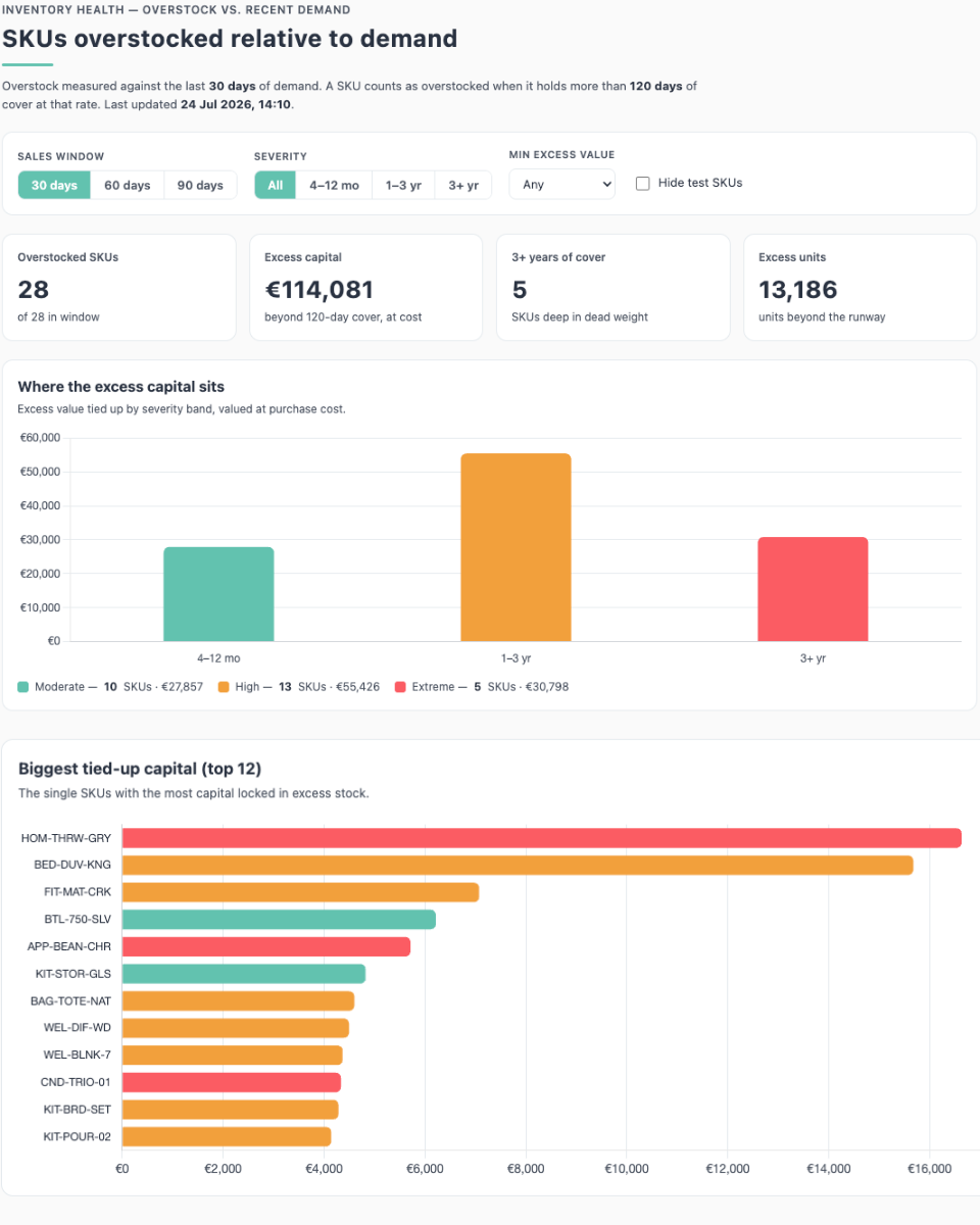
Finish by verifying the rows load and charts render without console errors.Wo Du deutlich mehr Bestand hältst, als die Nachfrage rechtfertigt. In Einheiten und Euro.
Build a live, persisted HTML dashboard artifact that shows which of my SKUs are overstocked relative to recent demand, pulling fresh data from byrd every time it opens. Single self-contained HTML file, light mode only.

## Data source
- Tool: report_overstock (byrd MCP).
- On first load and when the sales window changes, call it with { lookback_days: <30 | 60 | 90, default 30>, min_days_of_cover: 120 }.
- Row fields: product_name, sku, product_type, current_stock, units_sold, avg_daily_velocity, days_of_cover (nullable), excess_units, excess_value (nullable, EUR at cost). Cache per window.
- Severity bands from days_of_cover: moderate = 120-365 days, high = 365-1095, extreme = 1095+.

## Tech & style
- Chart.js v4 and Grid.js v5 from the allowed CDN, no other libraries, system font stack.
- Accent turquoise #62C2AF (#2F7A68 for links), text #293141, secondary #4E5664, borders #E5EAEE, page #FAFAFA, cards #fff.
- Band colours: moderate = turquoise #62C2AF, high = amber #F2A03D, extreme = red #FD5C63.

## Layout (top to bottom)
1. Header: eyebrow "Inventory health - overstock vs. recent demand", H1 "SKUs overstocked relative to demand", turquoise accent rule, subtitle with window, the 120-day overstock definition and last-updated time. No logo.
2. Controls card: sales-window buttons 30 / 60 / 90 days (re-fetches); severity filter All / 4-12 mo / 1-3 yr / 3+ yr; min-excess-value select (Any / EUR 500+ / 1,000+ / 5,000+); "Hide test SKUs" checkbox.
3. Four KPI cards: Overstocked SKUs (of N), Excess capital (beyond 120-day cover, at cost), 3+ years of cover count, Excess units.
4. Two charts stacked vertically: "Where the excess capital sits" (bar of excess value per severity band with legend showing counts) and "Biggest tied-up capital (top 12)" (horizontal bars coloured by band, SKU on axis, cover and units in tooltip).
5. Recommended actions: liquidate/write off 3+ yr dead weight, run promos on 4-12 mo overstocked sellers, pause reordering & renegotiate MOQs for 1-3 yr SKUs, clean up test SKUs, add missing cost prices.
6. Grid.js table (sortable, searchable, 12 rows/page) sorted by excess value desc: SKU (hover copy button + open-in-byrd link to https://app.getbyrd.com/inventory/products/all?q=<sku>&fields=sku), Product, Severity icon with tooltip, Stock, Sold, Cover (e.g. "189d" or "3.6y", red when 3+ years), Excess units, Excess EUR. Above it: "Showing N SKUs" + "Copy N SKUs" button.
7. Footer explaining: overstock = stock beyond 120 days of demand at the recent rate; days of cover = stock / avg daily units sold; missing cost prices make excess value a floor.

## Details
- EUR whole numbers, thousands separators. Escape all dynamic HTML.
- Custom positioned tooltip div driven by data-tip attributes (native tooltips don't work in the sandbox).
- Handle a missing connector gracefully; show loading and error states.

Finish by verifying the rows load and charts render without console errors.
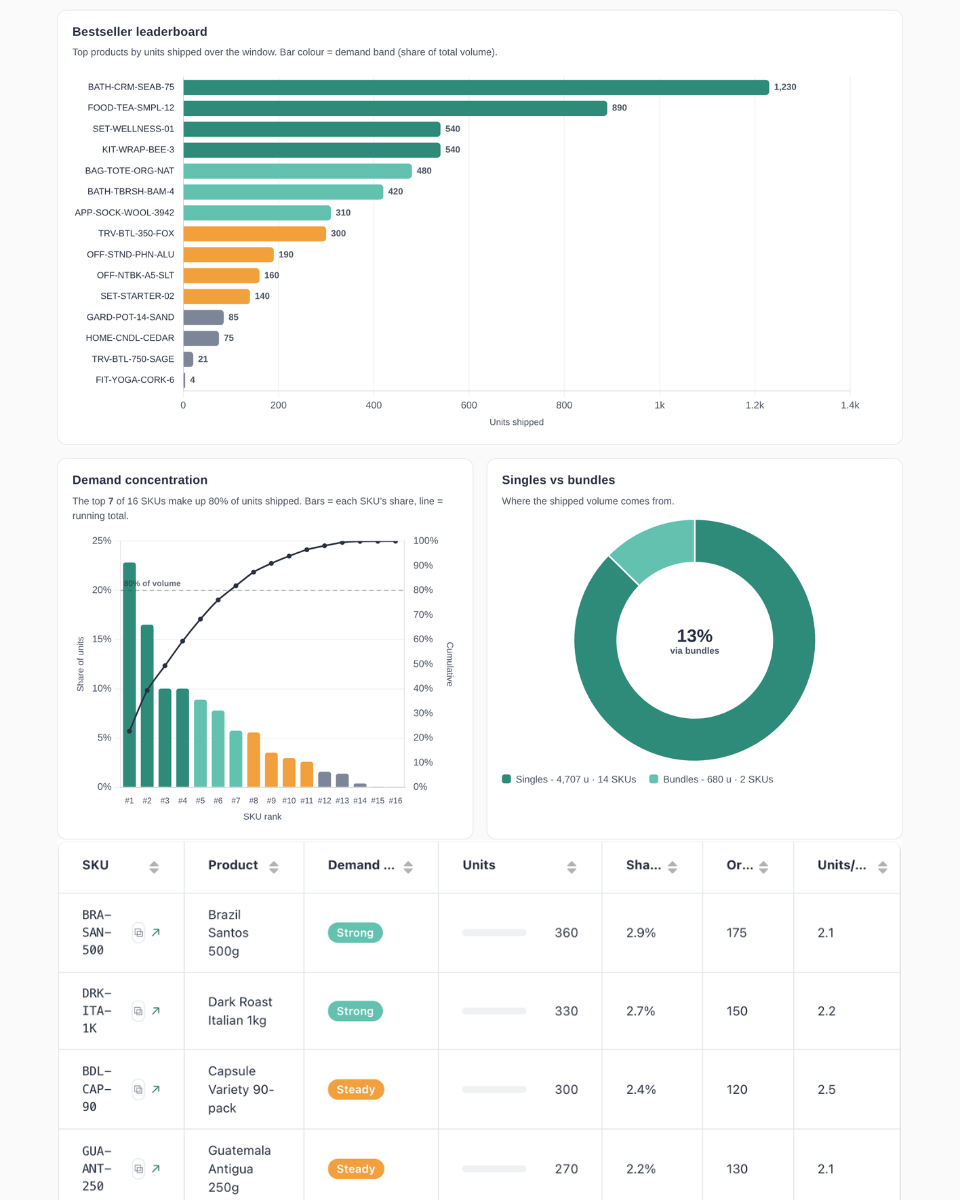
Deine Bestseller, wie konzentriert die Nachfrage ist und welche Produkte Du schützen solltest.
Build a live, persisted HTML dashboard artifact that shows which of my products moved the most units, pulling fresh data from byrd every time it opens. Single self-contained HTML file, light mode only.

## Data source
- Tool: report_top_movers (byrd MCP), called with { date_from, date_to } for a rolling window: Last quarter (trailing 90 days, default) / 6 months / 12 months. Cache per window.
- Row fields: product_name, sku, product_type, units_shipped, shipment_count, avg_daily_units. One row per product; only SKUs that shipped in the window (no zero-movers). Ranking is by units, not revenue.
- Merchandise only: singles = product_type "product" or "prepacked_product", bundles = "bundle"; exclude packaging/branding/alias types.
- Classify each SKU into cumulative-share demand bands computed over the filtered universe (product-type filter + hide-test applied): Bestseller = top SKUs up to 50% of total units, Strong = 50-80%, Steady = 80-95%, Long tail = last 5%. The demand-band and min-units controls act as drill filters on top: KPIs, Pareto and mix stay at universe level while the leaderboard and table respond.

## Tech & style
- Chart.js v4 and Grid.js v5 from the allowed CDN, no other libraries, system font stack.
- Accent turquoise #62C2AF (#2F7A68 for links), text #293141, secondary #4E5664, borders #E5EAEE, page #FAFAFA, cards #fff.
- Demand-band colours: Bestseller dark green #2F7A68, Strong turquoise #62C2AF, Steady amber #F2A03D, Long tail grey #9CA0A8.

## Layout (top to bottom)
1. Header: eyebrow "Demand & sales - bestsellers & fast movers", H1 "Which products moved the most units?", turquoise accent rule, subtitle with the window's date range + "ranked by units shipped" + last-updated time. No logo.
2. Controls card: period buttons Last quarter / 6 months / 12 months (re-fetches); product-type buttons All / Singles / Bundles; demand-band buttons All / Bestsellers / Strong / Steady / Long tail; min-units select; "Hide test SKUs" checkbox.
3. Four KPI cards: Units shipped (total + per day), Products shipped (count + avg units each), Top seller (units + name + share of volume), Top-10 concentration (% of units from 10 SKUs).
4. Hero panel "Bestseller leaderboard": horizontal bars of the top 15 by units shipped, coloured by demand band, with unit labels drawn at the end of each bar (reserve right padding so labels never clip; small custom plugin).
5. Two panels side by side: "Demand concentration" Pareto combo chart (per-SKU share bars + cumulative-share line on a right 0-100% axis, dashed guide at 80% with dynamic sub-text "top N of M SKUs = 80% of volume") and a singles-vs-bundles doughnut with the bundle share rendered in the centre hole (custom plugin).
6. Recommended actions: protect bestsellers from stockouts (name the top SKUs), comment on concentration risk (high/balanced), highlight bundles pulling volume (or basket depth if no bundles), and the broadest-reach product (most orders). Data-driven with impact numbers.
7. Grid.js table (sortable, searchable, 12 rows/page) sorted by units desc: SKU (hover copy button + open-in-byrd link to https://app.getbyrd.com/inventory/products/all?q=<sku>&fields=sku), Product, Demand-band badge, Units as an inline mini-bar + number, Share %, Orders, Units/order. Give Grid.js columns with HTML headers an explicit id. Above: "Showing N products" + "Copy N SKUs" button.
8. Footer explaining: ranked by units shipped (shipment prices aren't reliable enough for revenue ranking); demand bands are cumulative-share buckets over the filtered universe; only SKUs with at least one shipment in the window appear.

## Details
- Thousands separators; shares with 1 decimal ("22.8%"); units/order with 1 decimal. Escape all dynamic HTML.
- Custom positioned tooltip div driven by data-tip attributes (native tooltips don't work in the sandbox).
- Handle a missing connector gracefully; show loading and error states.

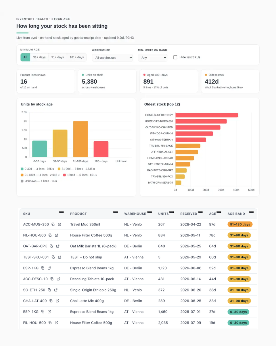
Finish by verifying the rows load, the leaderboard / Pareto / doughnut render, and there are no console errors.Wie lange Bestand seit Wareneingang liegt und wo sich alter Bestand konzentriert.
Build a live, persisted HTML dashboard artifact that shows how long my on-hand stock has been sitting since goods receipt, pulling fresh data from byrd every time it opens. Single self-contained HTML file, light mode only.

## Data source
- Main tool: report_inventory_aging (byrd MCP), called once with { min_age_days: 0 }; filter client-side.
- Row fields: product_name, sku, product_type, warehouse_id, current_stock, received_at (nullable), age_days (nullable), aging_bucket ("0-30" | "31-90" | "91-180" | "180+"; treat anything else / missing receipt date as "unknown").
- Also call get_merchant_info once and use its warehouses list (id, name/display_name) to translate warehouse_id into a readable name; label unresolvable ids with a short placeholder instead of a raw UUID.

## Tech & style
- Chart.js v4 and Grid.js v5 from the allowed CDN, no other libraries, system font stack.
- Accent turquoise #62C2AF (#2F7A68 for links), text #293141, secondary #4E5664, borders #E5EAEE, page #FAFAFA, cards #fff.
- Age-bucket colours: 0-30d turquoise #62C2AF, 31-90d yellow #EBB94A, 91-180d amber #F2A03D, 180+d red #FD5C63, unknown grey #9CA0A8.

## Layout (top to bottom)
1. Header: eyebrow "Inventory health - stock age", H1 "How long your stock has been sitting", turquoise accent rule, subtitle "on-hand stock aged by goods-receipt date" + last-updated time. No logo.
2. Controls card: minimum-age buttons All / 31+ / 91+ / 181+ days (client-side filter); warehouse dropdown (populated from the data); min-units-on-hand select; "Hide test SKUs" checkbox.
3. Four KPI cards: Product lines shown (of N on hand), Units on shelf, Aged 180+ days (lines + % of units), Oldest stock (days + product name).
4. Two charts side by side: "Units by stock age" (bars per age bucket incl. Unknown when present, legend with lines + units per bucket) and "Oldest stock (top 12)" (horizontal bars of age in days, coloured by bucket, SKU on axis; product, units, received date and warehouse in tooltip).
5. Recommended actions: prioritise the single oldest lot (name, age, units, warehouse), review stock sitting 180+ days, flag the warehouse holding the most aged units, cross-check expiry dates for aged lots, clean up test SKUs and lines missing a goods-receipt date.
6. Grid.js table (sortable, searchable, 12 rows/page) sorted oldest first: SKU (hover copy button + open-in-byrd link to https://app.getbyrd.com/inventory/products/all?q=<sku>&fields=sku), Product, Warehouse, Units, Received (YYYY-MM-DD or "-"), Age ("412d" or "-"), Age band as a colour-coded badge. Above it: "Showing N lines" + "Copy N SKUs" button (de-duplicated).
7. Footer explaining: age = days since goods receipt at the warehouse; lines without a receipt date show as Unknown; recommendations reflect the full dataset while table, KPIs and charts follow the filters.

## Details
- Thousands separators; dates as YYYY-MM-DD. Escape all dynamic HTML.
- Custom positioned tooltip div driven by data-tip attributes (native tooltips don't work in the sandbox).
- Handle a missing connector gracefully; show loading and error states.

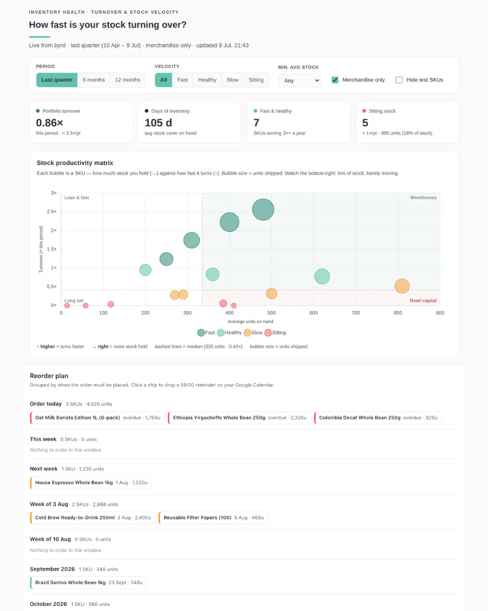
Finish by verifying the rows load and charts render without console errors.Wie schnell sich Dein Bestand dreht: Arbeitspferde vs. totes Kapital, pro SKU.
Build a live, persisted HTML dashboard artifact that shows how fast my stock is turning over, pulling fresh data from byrd every time it opens. Single self-contained HTML file, light mode only.

## Data source
- Tool: report_inventory_turnover (byrd MCP), called with { date_from, date_to } for a rolling window: Last quarter (trailing 90 days, default) / 6 months / 12 months. Cache per window.
- Row fields: product_name, sku, product_type, units_shipped, avg_inventory, turnover_ratio (nullable - if missing compute units_shipped / avg_inventory), days_in_period.
- Derive per SKU: annualized turns = turnover x 365 / days_in_period; days of inventory (DIO) = avg_inventory x days_in_period / units_shipped (infinity when nothing shipped).
- Velocity tiers from annualized turns: Fast >= 5x/yr, Healthy 3-5x, Slow 1-3x, Sitting < 1x.

## Tech & style
- Chart.js v4 and Grid.js v5 from the allowed CDN, no other libraries, system font stack.
- Accent turquoise #62C2AF (#2F7A68 for links), text #293141, secondary #4E5664, borders #E5EAEE, page #FAFAFA, cards #fff.
- Tier colours: Fast dark green #4E9B8A, Healthy light turquoise #9AD8CA, Slow amber #F2A03D, Sitting red #FD5C63.

## Layout (top to bottom)
1. Header: eyebrow "Inventory health - turnover & stock velocity", H1 "How fast is your stock turning over?", turquoise accent rule, subtitle with the active window's date range + last-updated time. No logo.
2. Controls card: period buttons Last quarter / 6 months / 12 months (re-fetches); velocity filter All / Fast / Healthy / Slow / Sitting; min-avg-stock select; "Merchandise only" checkbox (product_type = product, on by default); "Hide test SKUs" checkbox.
3. Four KPI cards: Portfolio turnover (this period + annualized), Days of inventory (portfolio average), Fast & healthy count (SKUs turning 3x+ a year), Sitting stock (count, units and % of stock).
4. Hero panel "Stock productivity matrix": Chart.js bubble chart - x = average units on hand, y = turnover this period, bubble size = units shipped, coloured by tier. Draw dashed median crosshairs and shade the top-right "Workhorses" and bottom-right "Dead capital" quadrants with corner labels (also label "Lean & fast" and "Long tail"). Tooltip: product, SKU, turns, annualized, avg stock, shipped. Below: a one-line reading guide (higher = faster, right = more stock held, medians, bubble size).
5. Two panels side by side: "Fastest & slowest movers" (horizontal bars: top 8 and bottom 8 by turnover this period, coloured by tier) and "Where your stock sits" (bar of average units on hand grouped by velocity tier).
6. Recommended actions: free cash tied up in Sitting stock (units + share), delist zero-movers, right-size the biggest stockholders in the Dead-capital quadrant, protect the fastest mover from stockouts.
7. Grid.js table (sortable, searchable, 12 rows/page) sorted by turnover desc: SKU (hover copy button + open-in-byrd link to https://app.getbyrd.com/inventory/products/all?q=<sku>&fields=sku), Product, Velocity badge, Shipped, Avg stock, Turns this period as a small horizontal mini-bar, Per year, Days of stock ("105d", "-" when infinite). Give Grid.js columns with HTML headers an explicit id. Above: "Showing N SKUs" + "Copy N SKUs" button.
8. Footer explaining: turnover is unit-based (units shipped / average on-hand units), not COGS-based; DIO = how many days current stock lasts at the period's shipping rate; recommendations reflect the full window while table, KPIs and charts follow the filters.

## Details
- Thousands separators; ratios with 2 decimals ("0.86x"), annualized with 1 ("3.5x/yr"). Escape all dynamic HTML.
- Custom positioned tooltip div driven by data-tip attributes (native tooltips don't work in the sandbox).
- Handle a missing connector gracefully; show loading and error states.

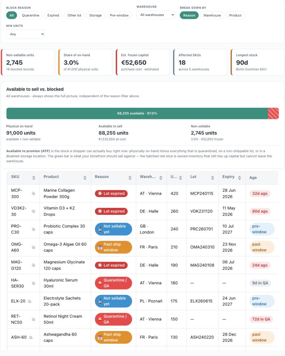
Finish by verifying the rows load and charts render without console errors.Welcher Bestand physisch da, aber nicht verkaufbar ist. Und wie Du ihn wieder freigibst.
Build a live, persisted HTML dashboard artifact that shows the stock I'm holding but can't sell - and why - pulling fresh data from byrd every time it opens. Single self-contained HTML file, light mode only.

## Data sources (call all in parallel on open)
- report_unavailable_stock (byrd MCP): one row per blocked record. Fields: product_name, sku, product_type, warehouse_id, unavailable_stock (units), reason ("blocked" = quarantine/QA | "lot_expired" | "lot_past_ship_window" | "lot_deactivated" | "lot_deleted" | "storage_deactivated" | "lot_not_shippable_yet"), block_reason (free text for quarantine), blocked_at, lot_number, lot_expiry_date. Treat unknown reasons as quarantine; drop rows with 0 units.
- report_stock_on_hand_value (byrd MCP): per-warehouse totals. Fields: warehouse_id, total_units, available_units, unavailable_units, total_purchase_value, available_purchase_value, unavailable_purchase_value (handle older schema without the available/unavailable split by treating totals as available).
- get_merchant_info: company name + warehouses list to translate warehouse_id into readable names; keep a fallback label for unresolved ids.
- Physical on-hand = available + unavailable. Frozen capital: exact at warehouse level from the value report; per-reason splits use the blocked stock's average unit cost (mark as estimate).

## Tech & style
- Chart.js v4 and Grid.js v5 from the allowed CDN, no other libraries, system font stack.
- Generic light palette: accent green #3E8E7E (#2C6456 for links), text #26303B, secondary #5A626E, borders #E5EAED, page #FAFBFB, cards #fff.
- Reason colours: quarantine red #E24C4B, lot expired dark red #CC3B3A, past ship window amber #E0912F, lot deactivated/deleted amber-brown, storage disabled slate #77808E, not-sellable-yet blue #3E90CE.

## Layout (top to bottom)
1. Header: eyebrow "Inventory health - blocked & non-sellable stock", H1 "Stock you're holding but can't sell", green accent rule, subtitle with company name + "reconciled against sellable on-hand" + last-updated time. No logo.
2. Controls card: block-reason buttons All / Quarantine / Expired / Other lot / Storage / Pre-window; warehouse dropdown; break-down-by buttons Reason / Warehouse / Product; min-units select.
3. Five KPI cards with coloured left borders: Non-sellable units, Share of on-hand (% of physical), Est. frozen capital (purchase cost), Affected SKUs (+ warehouse count), Longest stuck (days + product; from blocked_at for quarantine or expiry date for expired lots).
4. Hero panel "Available to sell vs. blocked": a true-scale horizontal availability bar - green segment "Available to sell" with units + %, red hatched segment for non-sellable with a callout label above; beneath it three figures (Physical on-hand / Available to sell + value / Non-sellable + % + frozen value) and a one-paragraph ATP explainer. Always shows the full warehouse picture regardless of the reason filter.
5. Breakdown panel: horizontal bars of non-sellable units grouped by the selected dimension (reason with per-reason colours + legend incl. estimated value, warehouse, or top-12 products), title adapting to the dimension.
6. Recommended actions, one card per present block group: dispose/write off expired lots (units, lot count, value), clear or escalate the quarantine queue (top block_reason, units >30 days), reconcile deactivated/deleted/out-of-window lots, relocate stock from disabled storage bins, and a no-action note for pre-window stock (becomes sellable automatically). Friendly all-clear state when nothing is blocked.
7. Grid.js table (sortable, searchable, 10 rows/page) sorted by units desc: SKU (hover copy button + open-in-byrd link to https://app.getbyrd.com/inventory/products/all?q=<sku>&fields=sku), Product, Reason chip with icon + tooltip, Warehouse, Units, Lot, Expiry, Age pill ("44d in QA" red when >=30d, "12d ago" for expired, "pre-window" blue, "past window" amber). Above: "Showing N blocked records" + "Copy N SKUs" button.
8. Footer explaining: sources and reconciliation; physical = sellable + non-sellable; lot-driven blocks derive from the lot, quarantine/storage blocks from the storage record; frozen capital exact per warehouse, estimated per reason; the availability bar always shows the full picture.

## Details
- EUR whole numbers, thousands separators, percentages with 1 decimal. Escape all dynamic HTML.
- Custom positioned tooltip div driven by data-tip attributes (native tooltips don't work in the sandbox).
- Handle a missing connector gracefully; show loading and error states.

Finish by verifying all three tools load, the availability bar and breakdown render, and there are no console errors.


